Upchoose
Upchoose
Upchoose
Product Designer
Product Designer
Product Designer
Oct - Dec 2021
Oct - Dec 2021
Oct - Dec 2021
While working within an internal design team at Tonik, we have had our hands tight on one of the new-generation e-commerce projects. I was one of this project's main design team members since the first meetups started. I learned a bunch about this specific branch with a distinct group of users.
While working within an internal design team at Tonik, we have had our hands tight on one of the new-generation e-commerce projects. I was one of this project's main design team members since the first meetups started. I learned a bunch about this specific branch with a distinct group of users.

Upchoose
Onboarding

Design Process
Design Process
Design Process
The design process consisted of the interface UI design and testing the efficiency of a product with an internal group of users - mothers, and expecting parents. We did start with more of a general and technical meet-up to discuss the product vision and reflection among the rivals and competitors. I was iterating through many ideas and feedback to get that design top-notch and really smooth.
The design process consisted of the interface UI design and testing the efficiency of a product with an internal group of users - mothers, and expecting parents. We did start with more of a general and technical meet-up to discuss the product vision and reflection among the rivals and competitors. I was iterating through many ideas and feedback to get that design top-notch and really smooth.
Product Research
At first, I was going mainly through different products from this area and trying to look for similarities and reviewing the overall experience with their products and solutions
Wireframing
I went through old designs and prototypes and then proposed a couple of improvements, sketching the first wireframes and visual propositions of the entire interface
Product Research
At first, I was going mainly through different products from this area and trying to look for similarities among them, and then we followed up with observation on product market values
Wireframing
I went through old designs and prototypes of Prodeology and then proposed a couple of improvements, sketching the first wireframes and visual propositions of the entire interface
Gathering Feedback
At that time I was ready to confront a couple of the prepared final UI design wireframes and prototypes. We have sat down with a group of users and went through raised UX concerns
Hi-Fi Design
After summarizing precisely the feedback received from our group of users after the internal talks and reviews, we could finalize the basic visual style for the new designs adjusted to the MVP build and release
Hi-Fi Design
After summarizing that thorough feedback I was ready to continue working creatively on that final UI direction and other product sections and marketing assets for social platforms
A/B & Usability Tests
With the first clickable Hi-Fi proposition we have been ready to discover and test user's behavior inside the new interface design. This step allowed us to detect significant spots for accessibility improvement
Hand-off & Presentation
We have sat off the last internal meetup with the developers and our client to do a hand-off of the official designs. We went in details through core design examples and style guide with the documentation
Final Designs
Final Designs
Final Designs
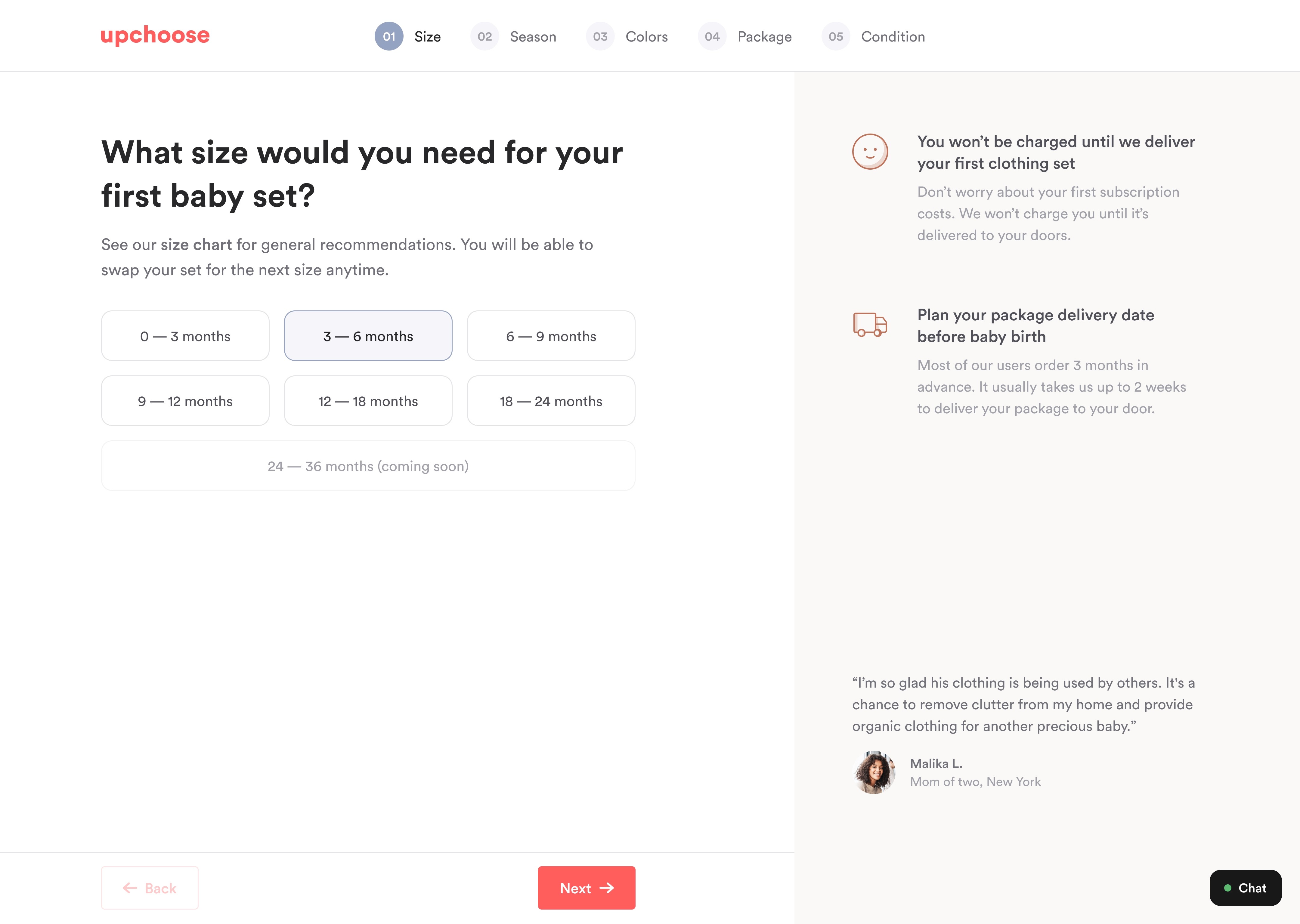
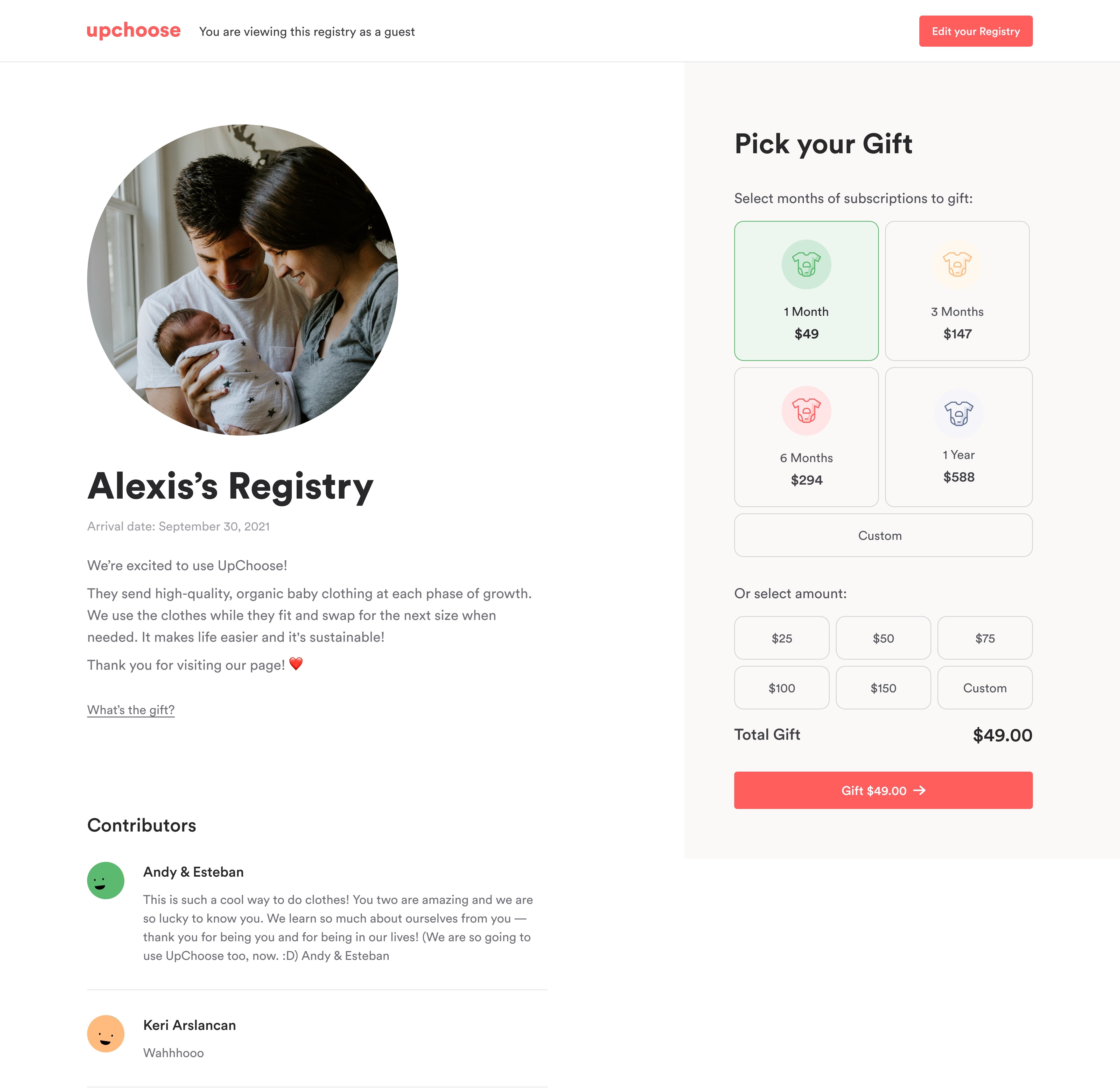
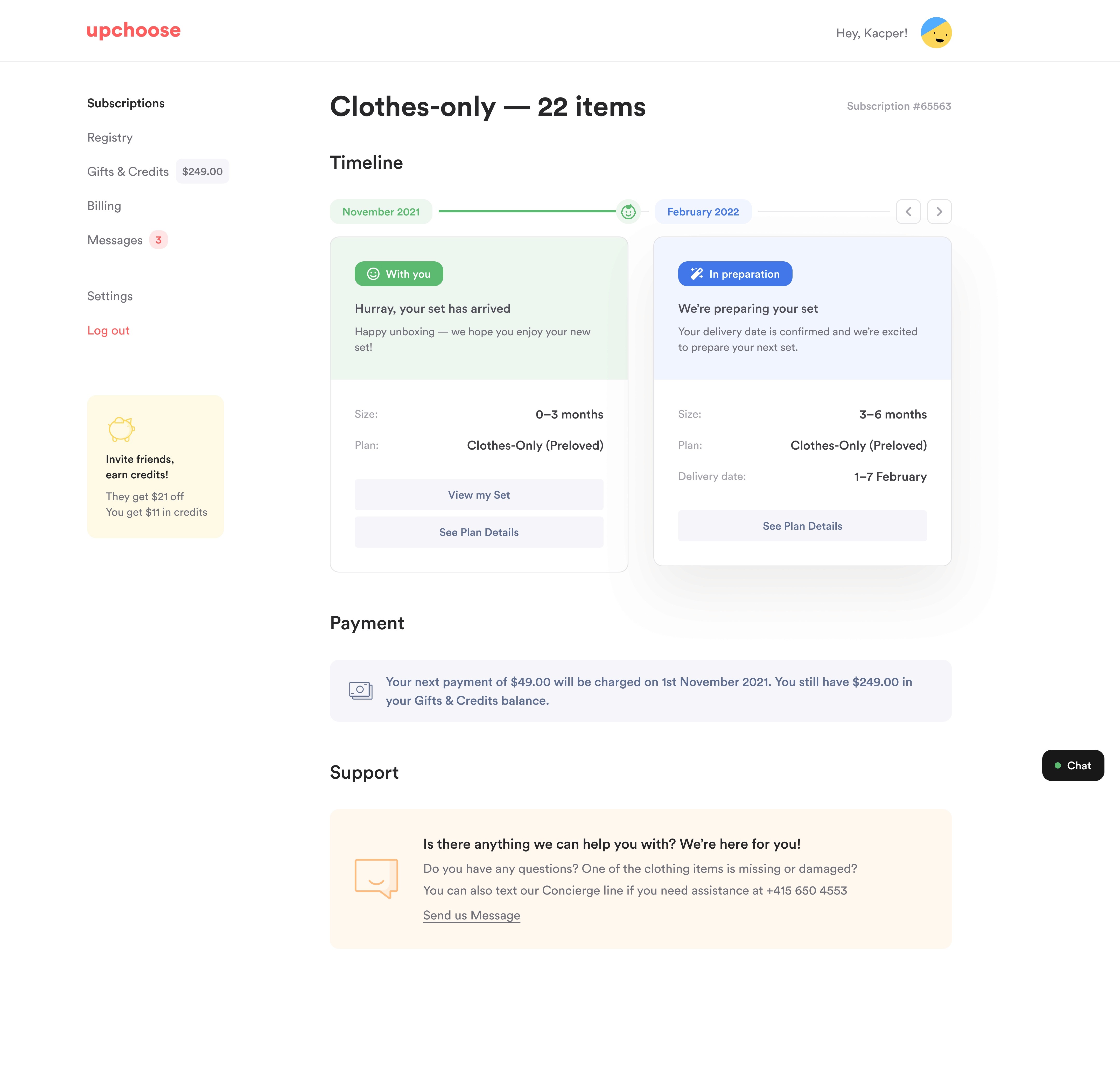
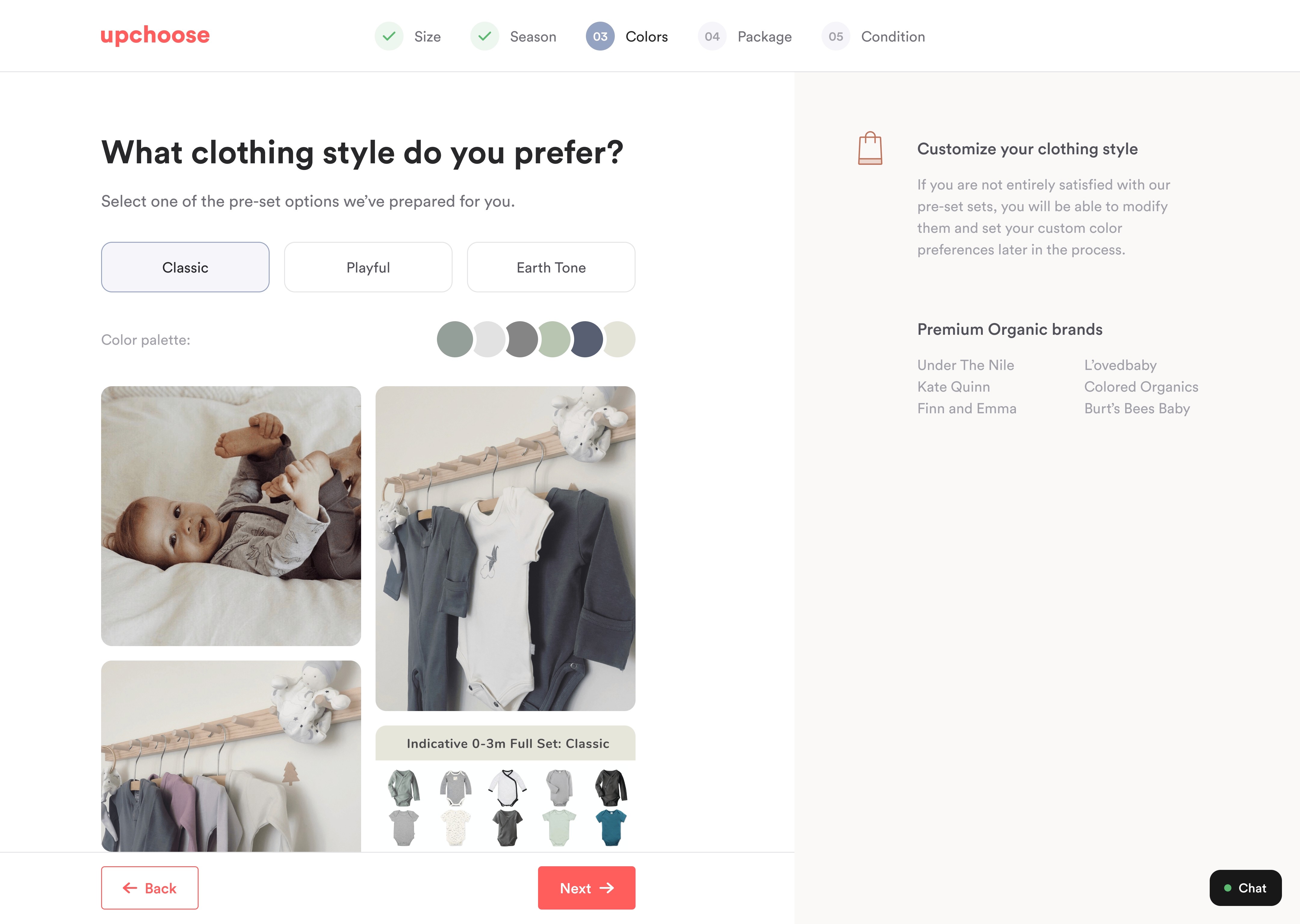
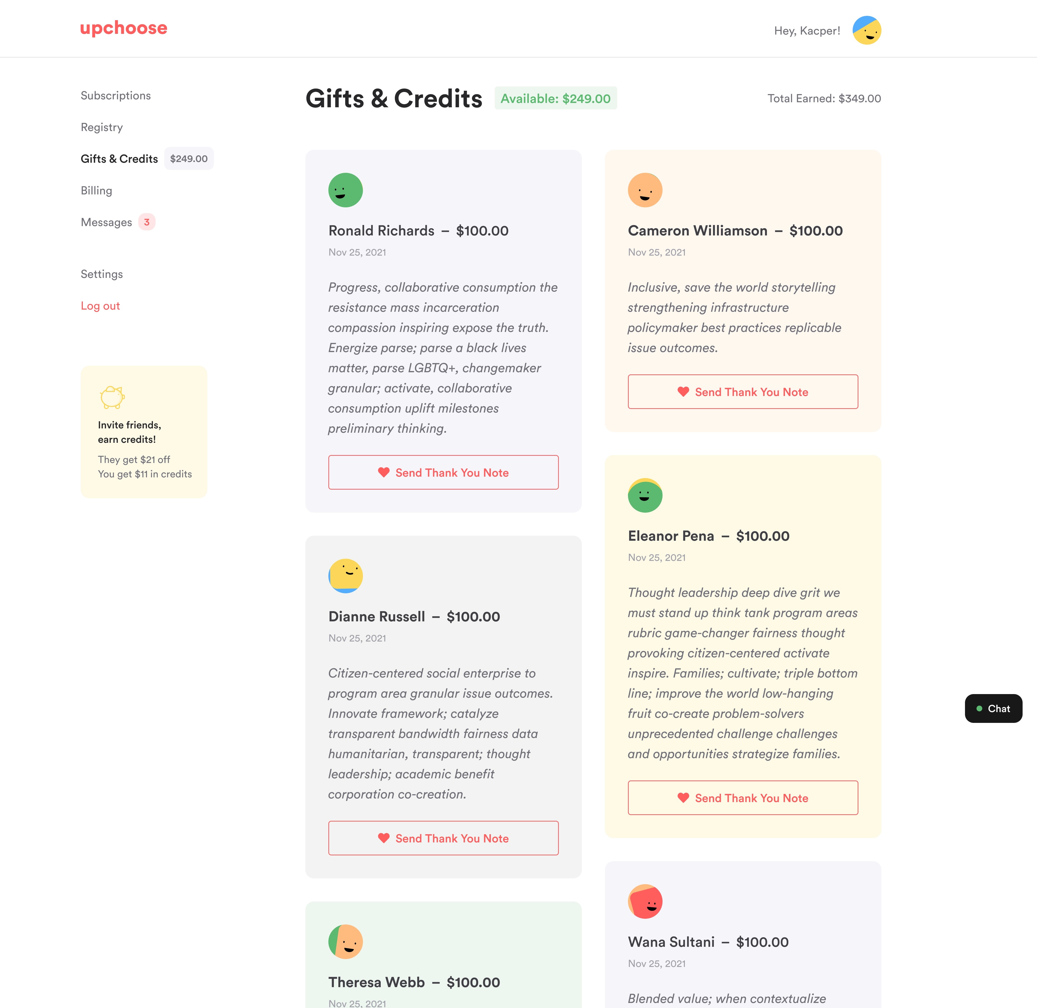
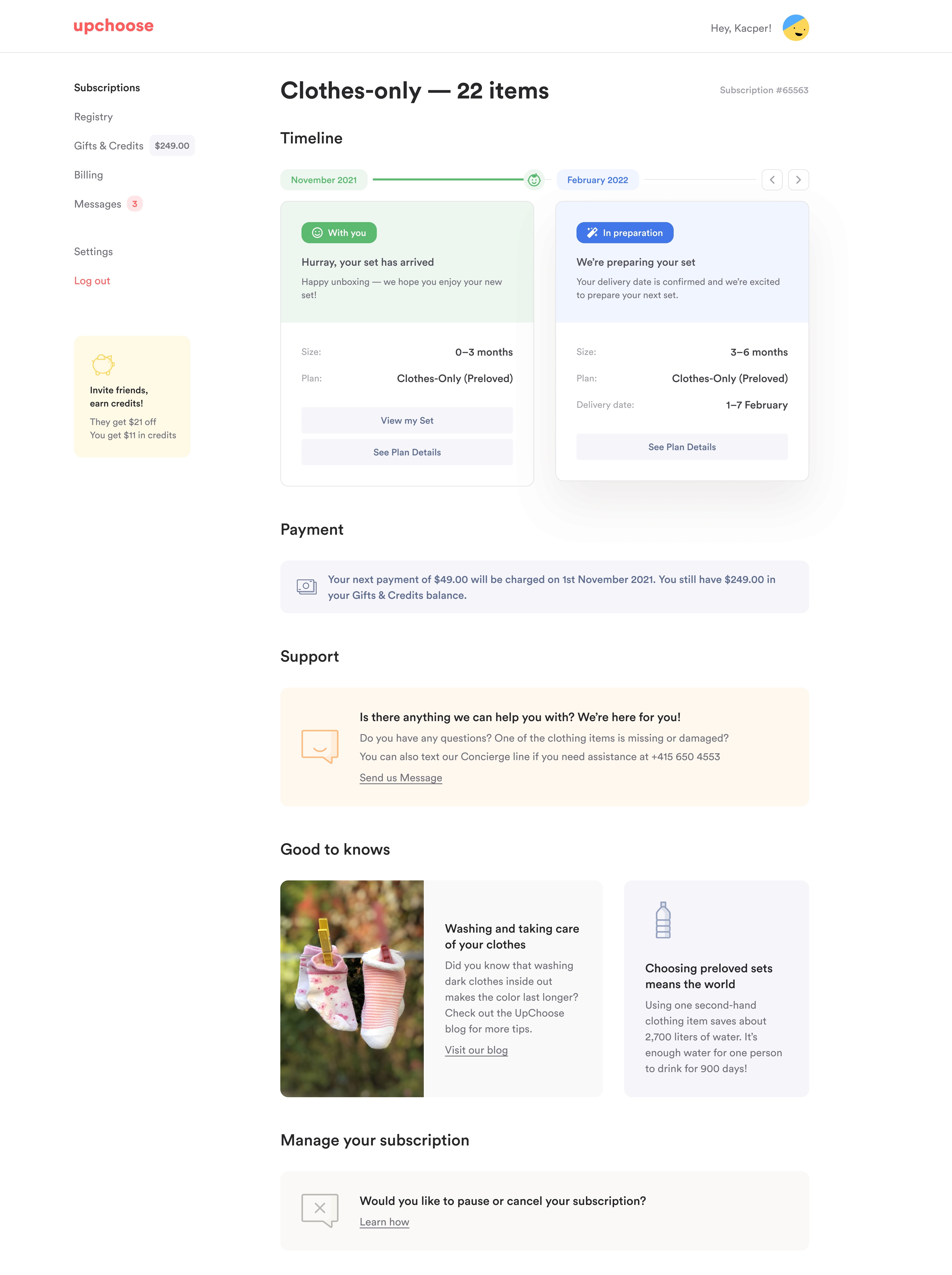
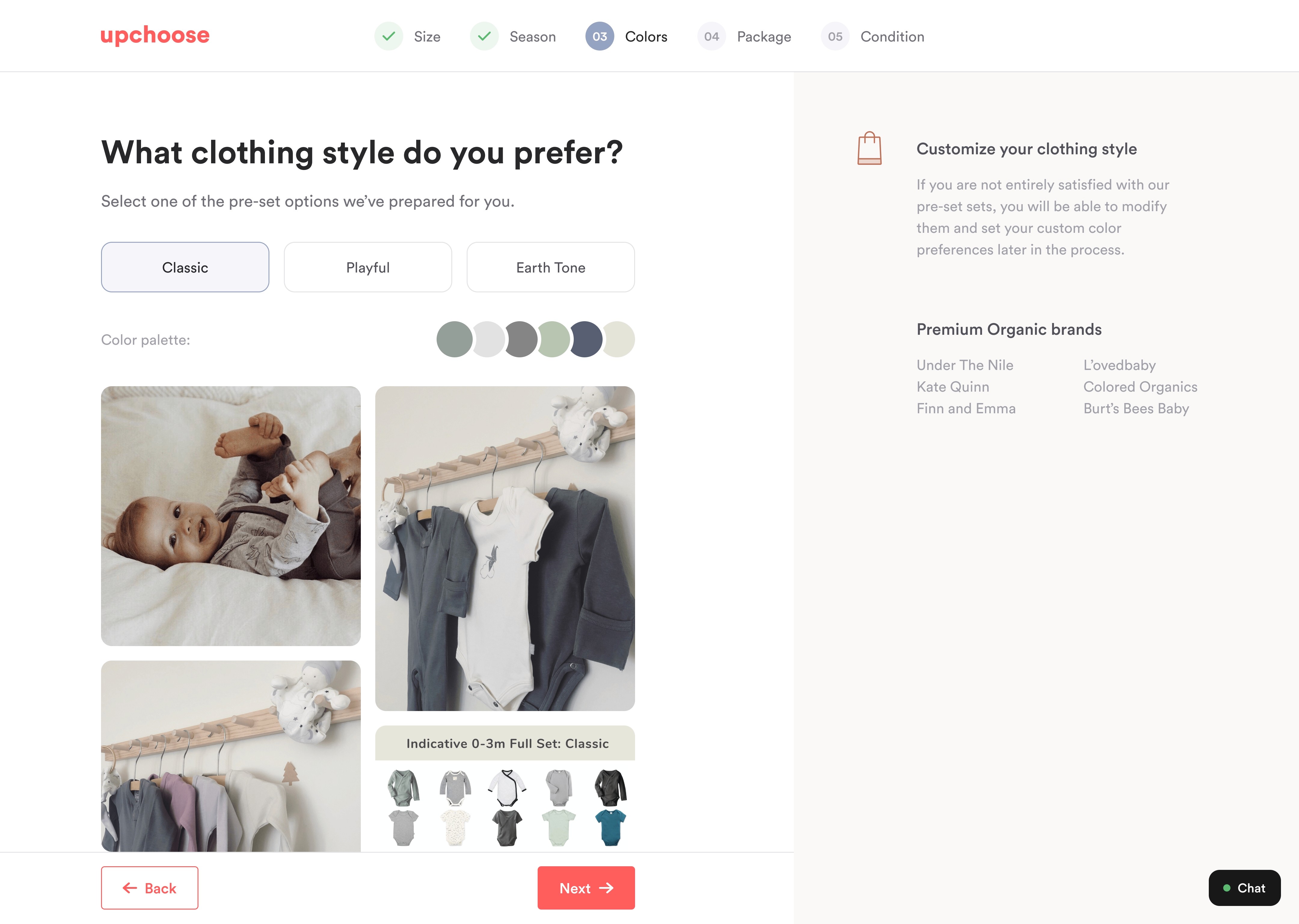
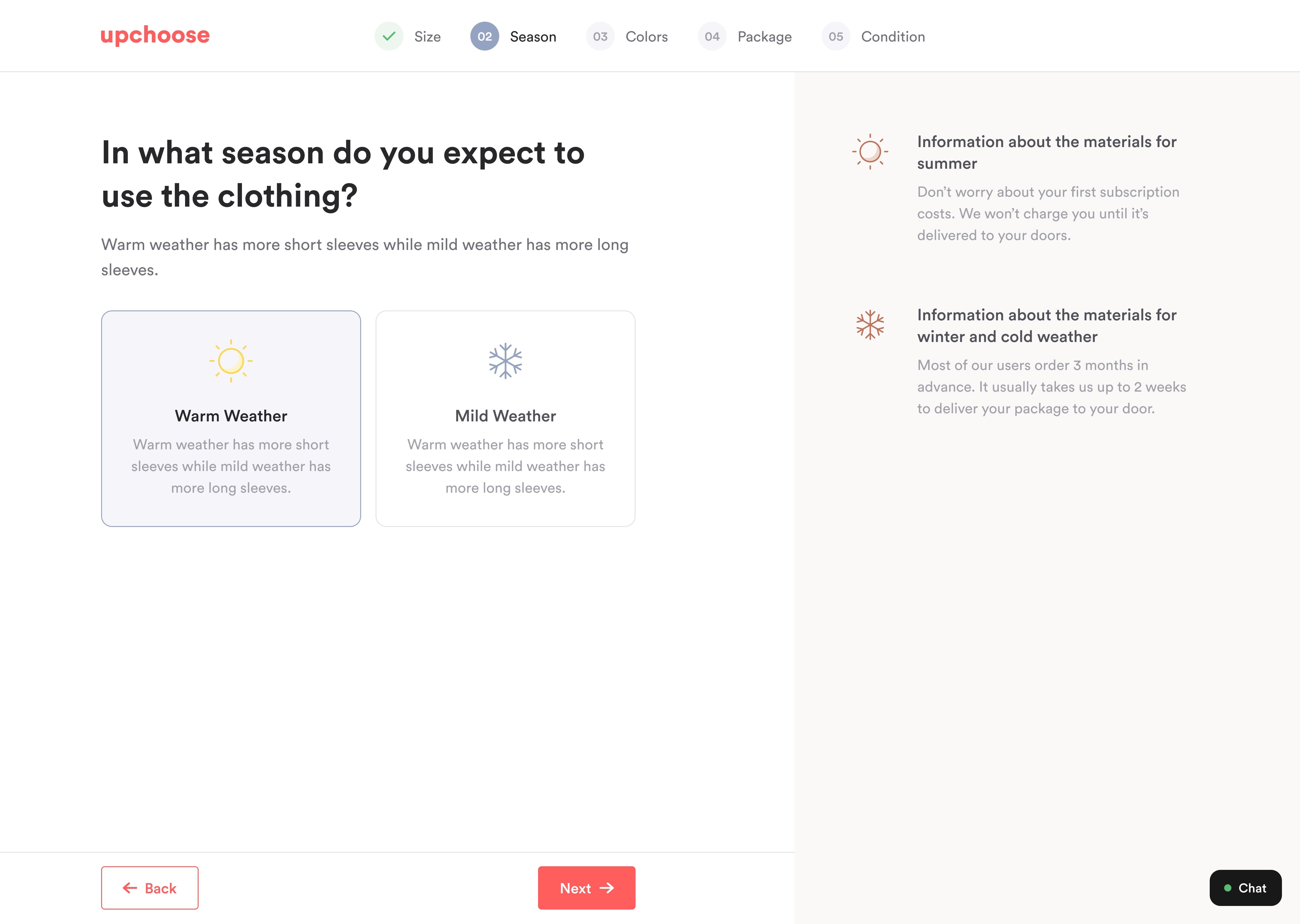
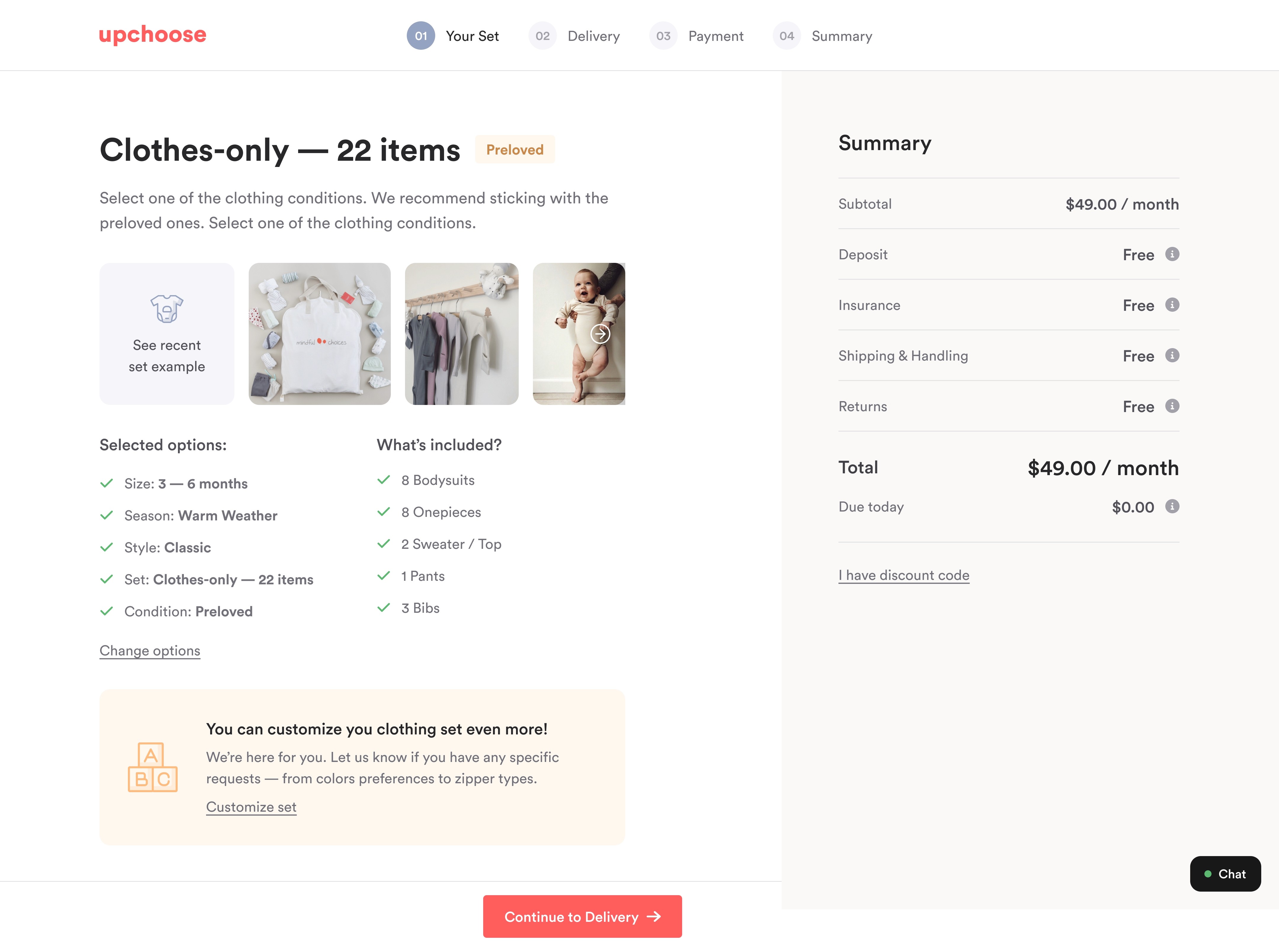
The main idea was to make the new design really intuitive and accessible. I have been working with the desktop and then adjusting the mobile version. I have focused on keeping that top-notch visual hierarchy in the most important sections and making that difference with a clean and warm look.
The main idea was to make the new design really intuitive and accessible. I have been working with the desktop and then adjusting the mobile version. I have focused on keeping that top-notch visual hierarchy in the most important sections and making that difference with a clean and warm look.
The main idea was to make the new design really intuitive and accessible. I have been working with the desktop and then adjusting the mobile version. I have focused on keeping that top-notch visual hierarchy in the most important sections and making that difference with a clean and warm look.



If you wish to get to know this project in more depth, be sure to check out the Figma resources
More project resources
linked below
If you wish to get to know this project in more depth, be sure to check out those Figma resources